Project overview

Introduction

In 2018, the My StarHub app, originally a self-help tool for mobile services, had become cluttered and slow, leading to customer complaints, a low Net Promoter Score (NPS), and poor app ratings.

As StarHub sought to expand its offerings with new verticals like Cloud Gaming (GameHub+) and Health Care (LifeHub+), we seized the opportunity to address existing user pain points and transform the app into a "super app", integrating mobile, broadband, and TV services while future-proofing it for new business lines.

My role

As the key UX designer, I took the redesign process by:

  • Researching: existing app review and analyse user feedback to pinpoint issues.

  • Designing: Created wireframes, prototypes and final design together with support from teammates to simplify the interface and integrate new services.

  • Collaborating: with product teams to align on goals and with developers to ensure the implementation.

  • Testing: Conducted usability tests to refine the design.

Impacts

Over 3 years after launch (2021), we significantly lift the app rating store and increase the Monthly Active Users (MAU) by 500K users.

+480K
+480K
+480K

MONTHLY ACTIVE USERS (MAU)

0.4/5
0.4/5
0.4/5

IMPROVED APP STORE RATING

1 |

1 |

RESEARCH

Our research combined an in-depth review of user feedback and the app’s current content inventory to guide the redesign.

1.1 Appstore user feedback review

Synthesized from app store feedback, the My StarHub app suffered from a low rating, reflecting widespread user dissatisfaction. Key complaints included:

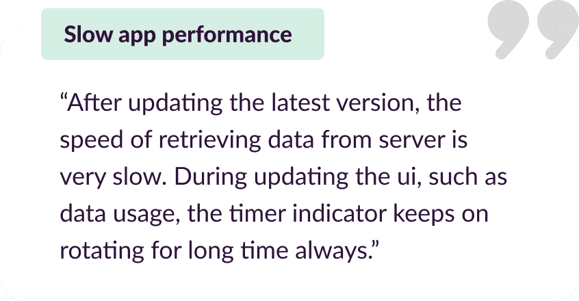
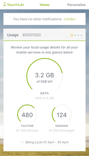
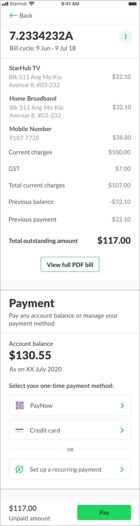
Delays in loading usage and billing details, echoing Homepage slowdowns, with users reporting the app often failing to load beyond the login page.

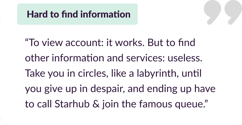
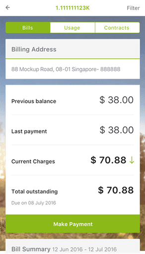
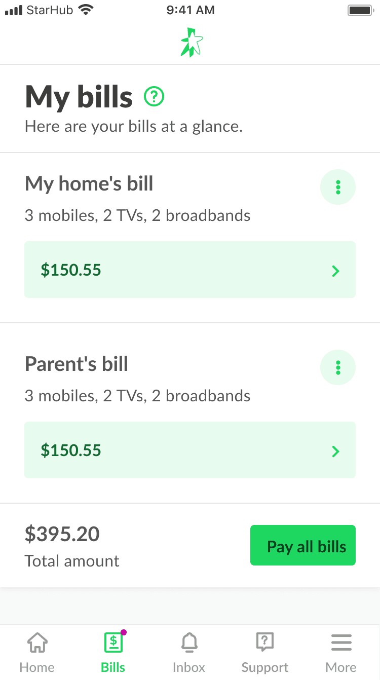
Users struggled to access core tasks like bill payments and usage checks due to buried features, requiring multiple clicks for simple actions.

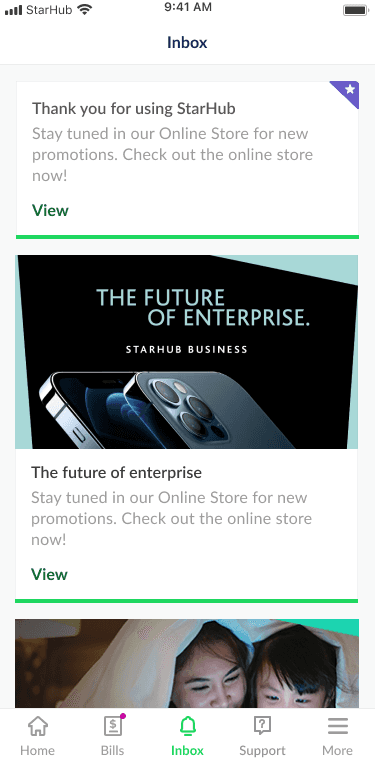
Home screen promotions, redundant links frustrated users, with frequent pop-up ads and excessive marketing content hindering usability.

1.2 Existing app inventory review

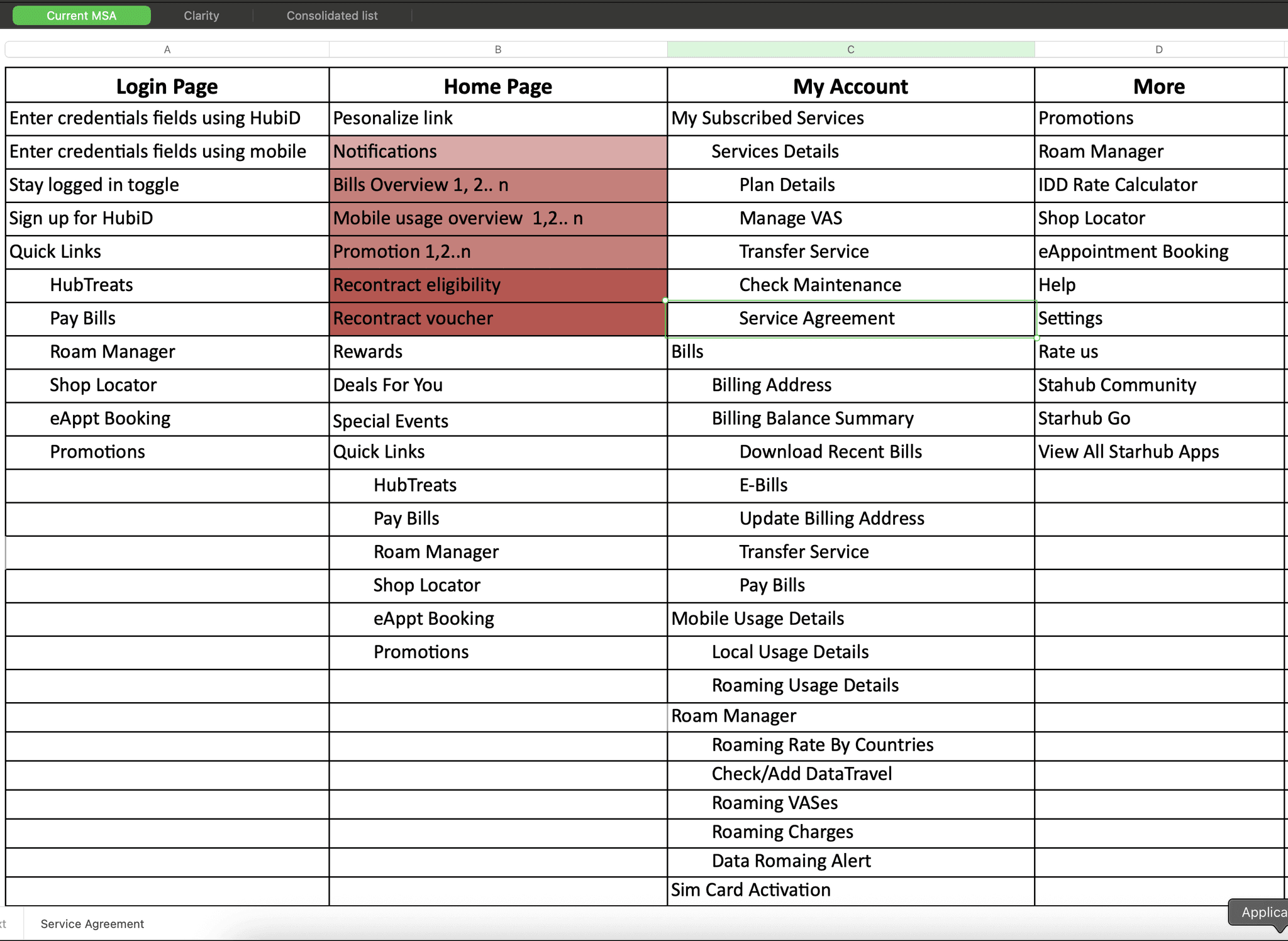
Looking at the current app’s structure revealed the followings:

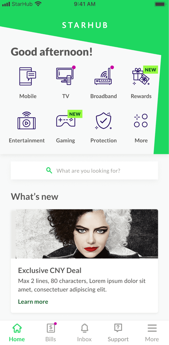
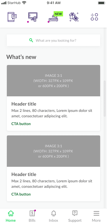
Homepage: Overloaded with cards (e.g., Notifications, Bills Overview, Promotions, Mobile Usage), significantly slowing down app loading especially for customer with multiple services which is aligned with app store complaints about performance.

Homepage Limitations: Not future-proof for StarHub’s expanding lines of business (LOB), lacking flexibility to accommodate new services like GameHub+ or LifeHub+.

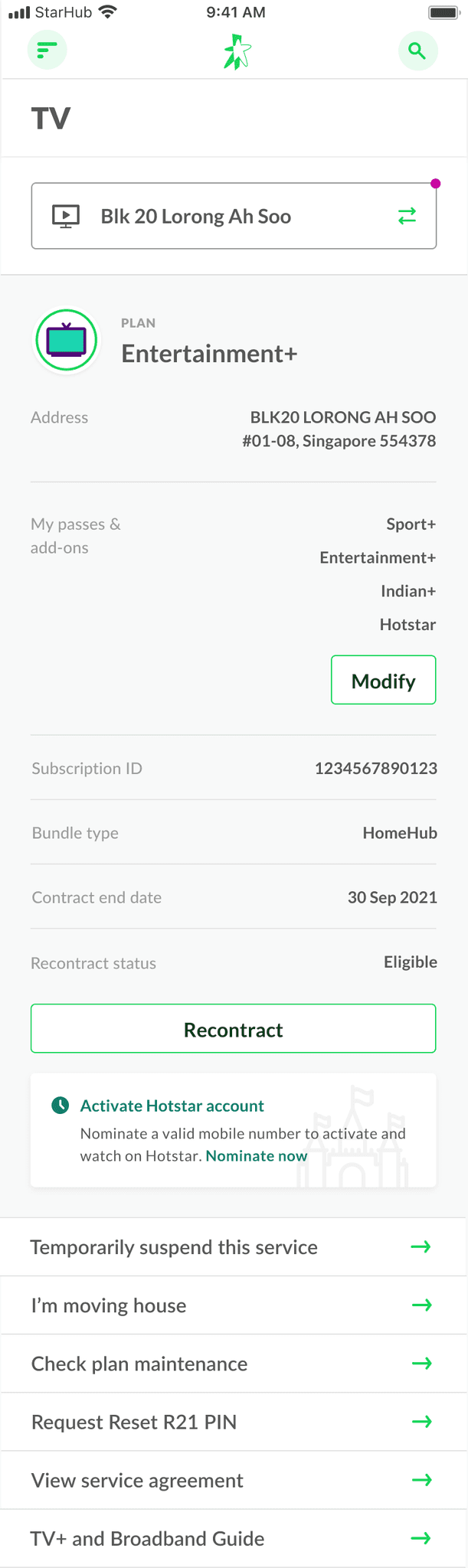
My Account: Feature-packed with options like Subscribed Services and Manage VASes, but these are buried in submenus and primarily focused on managing mobile services and bills, limiting accessibility and scope.

More Page: Contains uncategorized tools (e.g., Roam Manager, Shop Locator) and duplicates features found in the Quick Links section across the app, creating redundancy that could be optimized and better organised.

2 |

2 |

DESIGN

2.1 Design principal

From what we learned in Research phase, we aligned with stakeholders on design directions we want to take:

Optimize Performance

Improve loading times for customers with multi-services views.

Declutter

Regrouping & prioritize essential features and optimise where, when & how we show promo, ads.

Future-proof

for new business expanding in the future.

2.2 Design directions

Simplified &
future-proof Dashboard

Redesigned as the first page users see, featuring 8 gateway icons for intuitive access to key services: Mobile (usage, plans), TV (subscriptions, channels), Broadband (plans, settings), Premier League (elevated to level 1 to highlight StarHub’s exclusive broadcasting rights), Entertainment (GameHub+) (cloud gaming features), Protection (LifeHub+) (healthcare services), Rewards (relocated from bottom navigation for prominence), and More (a placeholder for future LOBs, ensuring scalability). Each icon leads to dedicated sections, reducing Homepage clutter and improving loading times under 2 seconds, while supporting new business lines.

Simplified & future-proof Dashboard

Redesigned as the first page users see, featuring 8 gateway icons for intuitive access to key services: Mobile (usage, plans), TV (subscriptions, channels), Broadband (plans, settings), Premier League (elevated to level 1 to highlight StarHub’s exclusive broadcasting rights), Entertainment (GameHub+) (cloud gaming features), Protection (LifeHub+) (healthcare services), Rewards (relocated from bottom navigation for prominence), and More (a placeholder for future LOBs, ensuring scalability). Each icon leads to dedicated sections, reducing Homepage clutter and improving loading times under 2 seconds, while supporting new business lines.

Simplified &
future-proof Dashboard

Redesigned as the first page users see, featuring 8 gateway icons for intuitive access to key services: Mobile (usage, plans), TV (subscriptions, channels), Broadband (plans, settings), Premier League (elevated to level 1 to highlight StarHub’s exclusive broadcasting rights), Entertainment (GameHub+) (cloud gaming features), Protection (LifeHub+) (healthcare services), Rewards (relocated from bottom navigation for prominence), and More (a placeholder for future LOBs, ensuring scalability). Each icon leads to dedicated sections, reducing Homepage clutter and improving loading times under 2 seconds, while supporting new business lines.

Marketing Balance

- Only show offer where appropriate and relevant in respective LOBs and Shop

- Put Inbox as one of the main navigation item for personalised offers instead of spamming generic offer everywhere.
Marketing Balance

- Only show offer where appropriate and relevant in respective LOBs and Shop

- Put Inbox as one of the main navigation item for personalised offers instead of spamming generic offer everywhere.
Marketing Balance

- Only show offer where appropriate and relevant in respective LOBs and Shop

- Put Inbox as one of the main navigation item for personalised offers instead of spamming generic offer everywhere.
Ensure key customers journey still works well

- Based on data, most self-help tasks customer made in the app is check mobile usage and check/pay bills.

- Added Bills to the main navigation for quick access and positioned the Mobile icon as the first gateway on the Homepage, ensuring seamless navigation and addressing user feedback about buried features.
"Divide & conquer"

- Avoided displaying multiple services on one screen to reduce loading times and boost performance.


- Introduced a feature allowing customers to select a service to view/manage and set a default service view (e.g., Mobile as default),
"Divide & conquer"

- Avoided displaying multiple services on one screen to reduce loading times and boost performance.

- Introduced a feature allowing customers to select a service to view/manage and set a default service view (e.g., Mobile as default),
"Divide & conquer"

- Avoided displaying multiple services on one screen to reduce loading times and boost performance.


- Introduced a feature allowing customers to select a service to view/manage and set a default service view (e.g., Mobile as default),

2.3 Migrate & improve existing features

Besides, all existing features (e.g., "Manage VASes," "Download Recent Bills," "Roam Manager"…etc) will also migrated and aligned with the EverGreen Design System, a unified UI framework ensuring consistency and maintainability.

The design modernized the UI with a clean, responsive layout, ensuring scalability and a user-friendly experience.

3 |

VALIDATIONS

VALIDATION

We conducted multiple validation sessions (face-to-face usability testing, remote unmoderated testing using UXArmy.com platform) for each of the important features we designed and migrated into the new app. The one below is an example.

We conducted multiple small validation sessions (face-to-face usability testing or remote unmoderated testing) for each of the important features we designed and migrated into the new app. The two below are only examples:

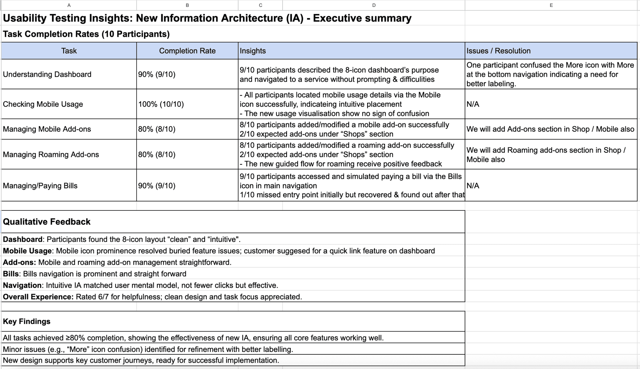
3.1 Usability testing session & insights

The first test - we conducted after revamping with 10 test participants to evaluate the app new Information Architecture (IA), focusing on key tasks:

  • Understanding of new Dashboard

  • Checking Mobile Usage

  • Managing Mobile Add-ons

  • Adding/Managing Roaming Add-ons

  • Managing/Paying Bills

    Participants were observed to assess ease of use, task completion, and comprehension of the 8-icon dashboard layout to ensure the new design supported key customer tasks without disruption.

The fist test we conducted with 10 test participants to evaluate the app new Information Architecture (IA), focusing on key tasks:

  • Understanding of new Dashboard

  • Checking Mobile Usage

  • Managing Mobile Add-ons

  • Adding/Managing Roaming Add-ons

  • Managing/Paying Bills

    Participants were observed to assess ease of use, task completion, and comprehension of the 8-icon dashboard layout to ensure the new design supported key customer tasks without disruption.

3.2 Remote un-moderated testing

For a lean and quick validations, we used un-moderated testing method using UXArmy.com platform for each of the feature we migrated. The prototype will be developed, integrated into the testing platform, and evaluated by participants recruited from the platform's user panel.

For rapid and efficient validation, we conducted unmoderated testing via the UXArmy.com platform for features we want to have insights to aid with design decision.

4 |

WHAT'S NEXT

VALIDATION

The revamp successfully making the first step to reposition My StarHub as a super app, leveraging its existing extensive feature set while enhancing usability.

  • Simplified UX: Reduced clutter and improved access to features like mobile usage, bills.

  • Performance Gains: Faster load times delighted users.

  • Scalability: New verticals integrated seamlessly, addressing Homepage limitations.

This project established a solid foundation for My StarHub’s evolution into a versatile, customer-centric platform.

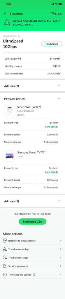
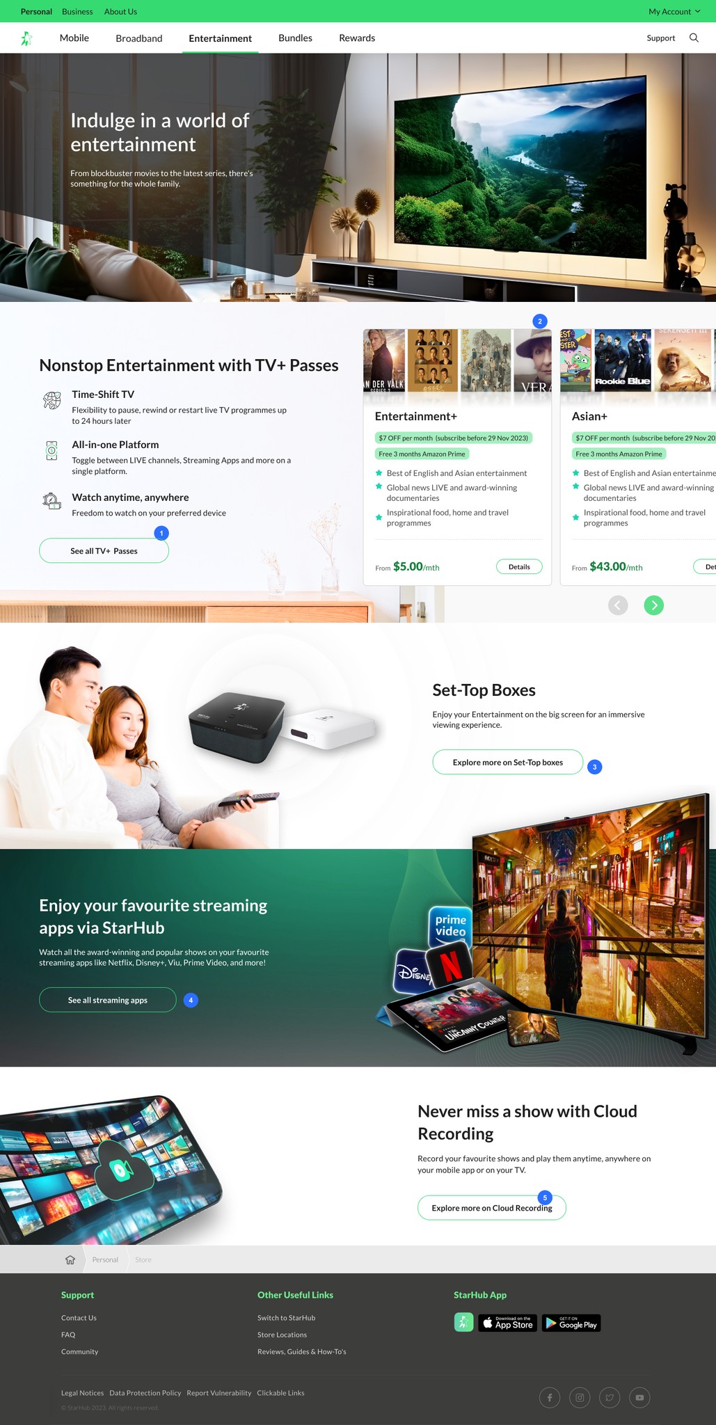
Based on this foundation, we started to work on the future of My StarHub App in 2023 - 2024, when we push the app experience in to the next level with multiple transaction that customer had to go down to physical shops now they can all do everything in one app.

Detailed case study will be released soon. Sneak peak on the design as follows.

Strewth, you’ve made it this far!

Fancy a chat over a cuppa?

namnv8889@gmail.com

www.linkedin.com/in/namnz

© 2025 www.namnz.com

namnv8889@gmail.com

www.linkedin.com/in/namnz

© 2025 www.namnz.com

Strewth, you’ve made it this far!

Fancy a chat over a cuppa?

namnv8889@gmail.com

www.linkedin.com/in/namnz

© 2025 www.namnz.com