


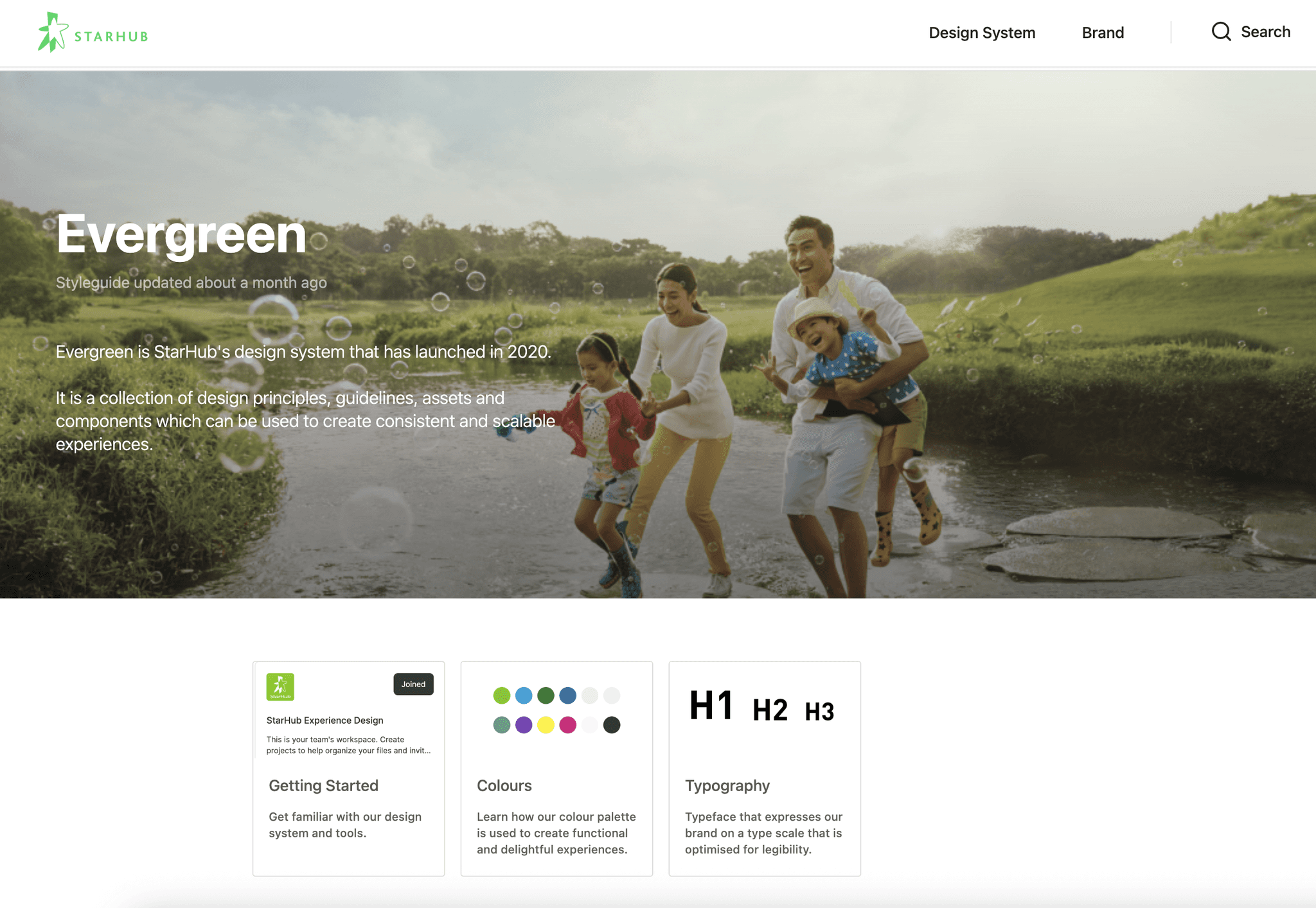
Project overview
Introduction
Our team of five designers set out to create “StarHub Evergreen,” a design system built from scratch to unify StarHub’s digital products, align with the Brand & Marcom team’s branding guidelines, and enhance efficiency across design and development teams.
Starting with a fresh set of guidelines, we aimed to deliver consistency and scalability to StarHub’s digital ecosystem, but faced significant challenges that shaped our process and taught us critical lessons about establishing and sustaining a design system in a corporate environment.
My role
As a member of the design team, I contributed to a collaborative effort where we rotated responsibilities, divided tasks, and tackled them collectively.
This approach allowed us to efficiently address the diverse needs of the project, from component design to testing and documentation, ensuring “StarHub Evergreen” met both creative and practical demands.
1.1 Analysis & Foundation
Foundation: We started with the Brand & Marcom guidelines that our company has to lay the foundation for our Design System, ensure our Design System is aligned with Brand and consistent everywhere across all digital platforms & physical assets.
UI Inventory: Review and documents all our existing components we are using across all platforms, removed unwanted components, marked the necessary ones.


1.2 Define & Design
Started with:
The foundation (design tokens) like colors, typography, spacing, breakpoints…etc
Together with the adoption of atomic design approach and our reviewed UI Inventory —we started document the Design System with atoms (buttons, labels, icons, checkboxes, radio buttons…etc), then molecules (search bar, forms, button group, message cards…etc), and organisms (headers, navigation bar, date pickup…etc).
Held weekly 3-hour design sprints to build components as our minimal commitment.


1.3 Test, Iterate & Launch
Link to Design System Documentation
1.4 Govern & Evolve
What We Did: Set up a rotating stewardship model among the five designers, with monthly reviews to address updates.
LESSONS LEARNT
Difficulty: Months into adoption, we hit a snag—teams wanted flexibility for unique features, but this risked diluting consistency. For example, marketing pushed for bold campaign-specific styles that clashed with our core system.
How We Tackled It:
Enable style variants or tokens for campaigns.
Set up governance process so new design needs are addressed systemically, not ad-hoc.
Explore using Templates to define flexible-yet-consistent page types.
Lesson:
Design systems shine at promoting consistency, scalability, and speed.
But campaigns and new features often demand visual novelty, custom interactions, or layout flexibility that core components don't support (yet).
Over time, people either:
Hack things outside the system (creating debt),
Or avoid the system entirely (worse).
Difficulty: With tight timelines and ongoing projects, dedicating time was tough. Designers juggled product work and design system tasks, sometimes designing components in parallel, leading to occasional misalignments.
How We Tackled It:
Blocked 3 hours weekly per designer for focused design system work, with a standing review meeting to sync progress.
Parallel design helped us stay relevant to live projects but stretched us thin.
Lesson: Secure dedicated time or a part-time specialist early—multitasking dilutes focus.
2.3 Adoption Resistance
Difficulty: Without a big project to revamp the entire StarHub app, adoption was slow. We couldn’t overhaul everything at once, and developers resisted long documentation, often misusing components.
How We Tackled It: Shifted to a gradual rollout—slotted components into existing projects one by one (e.g., updated buttons in a checkout flow). Paired designers with devs for quick Q&A instead of relying solely on docs.
Lesson: Adoption thrives on small wins and direct support, not just documentation.
Difficulty: Keeping up with changes was brutal. New components & variants piled up, and a 2022 brand refresh forced a major overhaul we couldn’t fully execute due to limited bandwidth.
How We Tackled It: We prioritized critical updates (e.g., new colors) and deferred less-used components.
Lesson: Without a sustainable governance model, ad hoc fixes fall apart when major changes hit.
2.5 Documentation
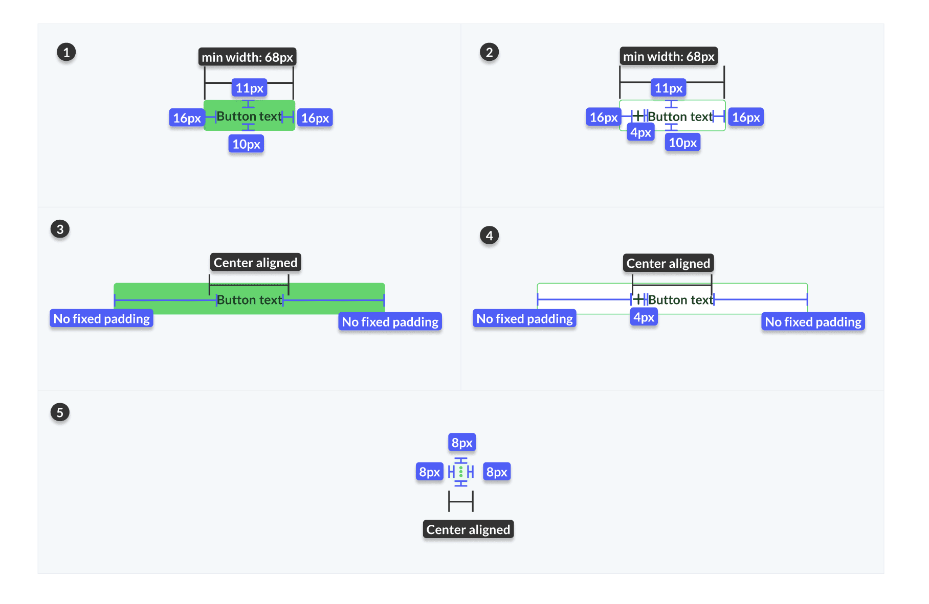
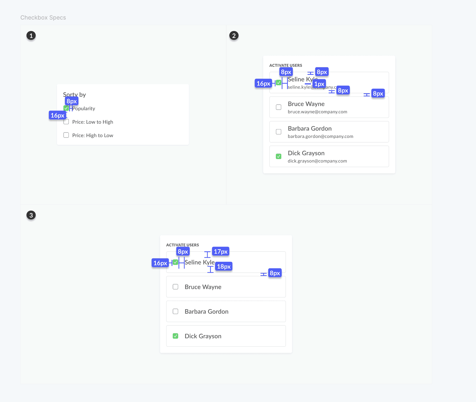
Difficulty: Developers missed key details in our ZeroHeight docs, leading to wrong implementations (e.g., incorrect padding on cards). Without code integration, the gap widened.
How We Tackled It: Simplified docs with more visuals and examples, and started one-on-one syncs with devs. Later, we pushed for a coded component library but unfortunately, it was rejected due to costly development effort by vendors.
Lesson: Docs must be concise and paired with code—text alone doesn’t cut it.